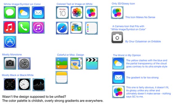
The inconsistencies of the new icons. Categorized by GreenGelatin on reddit.
Personally, I like the new operating system. I think the whole 3D concept is great, a good reason why icons and other elements needed to go flat. I like the typical screens and forms, even if they resemble Windows. I didn't have the chance to try it out, but I believe the authors who did and claim it is a huge step forward.
Apple has sold iOS 7 to me, probably also because I can easily ignore the various types of icons, and the different directions of gradients. I admit they could be better, but I can imagine designers hating it. Which means that all that Apple needs to do, is to introduce a new set of icons before the launch, something super coherent and amazing, and it will blow everyone's mind. Bam!, and all the heretics run back to the mothership. If the final icons would manage to exceed expectations as some other things seen in iOS 7 did so far, Apple wouldn't have to worry about their mobile program for years to come.

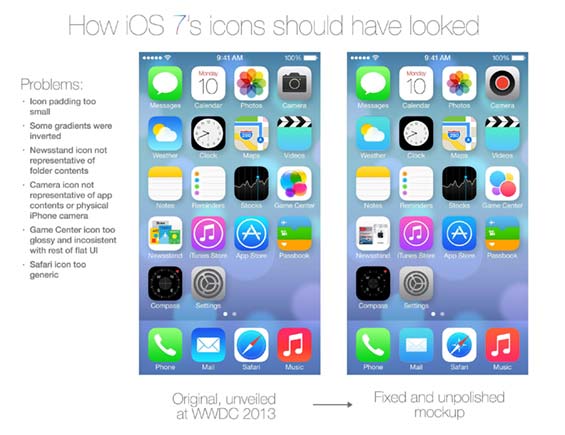
One of the icon redesigns, published by agent00420 on reddit. If a single person can do this in one day, imagine what Apple can do.
Think about it. Would a company which has been associated with great design for decades present something so weak unintentionally?
It's funny how such a controversy, a potential game changer and perhaps another great manipulation, something that has the power to change one strong emotion into another, is encapsulated in the form of 20 small pictures. It seems Apple has done it again.
(Cover image via @likeluis)