I'm not a professional graphic designer, but I've been doing web development for years and got to know a few things about it, both intentionally and accidentally. I hope my designer friends won't get mad with me simplifying design in this post, but the way I see it, there are mostly two main purposes design serves. One is to support function (present both in industrial and graphic design) and the other is to enable effective representation and communication (specific for graphic design).
Logos are probably one of the most praised elements of graphic design. They make an effective characterization of a company, product or service, besides being aesthetic and memorable to enable high user recollection. It's also good to have an original logo, something that stands out from the rest and helps a brand not to get mistaken with other brands. But there is always a trade-off between creativity and standard, and in our case of browser logos and icons, it looks like this desired representation was a bit more important than originality. Most of the browser logo designers went for a safe and predictable solution, producing one of the greatest graphic design cliches of our time.
When you think about the Internet and the World Wide Web, there are probably not so many geometrical shapes and colors you can associate it with. The net is huge, endless and fluid, so the proper shape is definitely not a triangle, a square or something else with edges. The net is global and it's everywhere, so the color representing it has to be something resembling our planet.
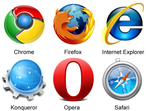
If you compare six of the most popular internet browser icons, you can see this concept in action. Most browser logos and icons are round and contain blue, except Opera, who went for red. But it's not just about the shape and the color, the bottom line is they generally look alike, using similar elements such as Earth, light beams and reflections. Opera logo stands out, but upon second observation, it kinda looks like an uncreative red Internet Explorer clone, so perhaps it's even worse than the others.
Are the designers behind these solutions to blame? Probably not. The internet browser is arguably the most widely used piece of software there is, so it's important that your mother also finds it's icon representable and appealing. The truth is we probably won't reinvent the World Wide Web or colonize the galaxy any time soon, so there is a good chance we also won't see any original and creative browser logos any time soon too. Therefore we just have to accept that round and blue it is.

Trademarks and logos are the property of their respective owners.