I used to work for an online advertising agency. For large projects we were usually trying to make a campaign extraordinary and special, something that would stand out from the rest and be creative and effective. When you are trying to achieve something like that you are usually limited by a great number of facts, such as the campaign budget, creativity of the team, capabilities of the designers and programmers, but perhaps most importantly, the technical issues and platform of the site that will serve the ads.
Looks like Wired.com and YouTube.com don't have those problems and are actually cooperating with the advertisers to go towards perfection. YouTube you know, but in case you haven't heard of Wired, it's an online blog and an off-line magazine, one of the most respectable with focus on new technologies. They have great content, high reach and are a big potential for advertisers and marketers. Some of them are actually prepared to go for it all the way. I have noticed two campaigns on Wired and one on YouTube that really stand out, all of them fully integrated with the site. Forget floaters and takeovers, in-site advertising is the bomb. We can only wonder how much money was spent on the design, development and the serving of the ads.
Acura
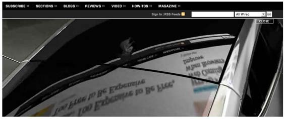
The Acura ZDX banner works in a such a way that the site's main menu and some content are reflected onto the car (fake, of course). This makes it look as if the commercial is fully integrated with the site, making it interesting and appealing. It doesn't do anything special besides that, but the graphic rendering is pretty good.

Apple
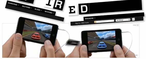
Apple's iPod nano and iPod touch advertisements on Wired.com are even more outstanding. iPod touch goes a step further, breaking apart the site and its main menu (fake again, of course), trying to communicate the motion sensitivity, multi-player gaming and other features of the gadget. This approach goes beyond in-site advertising, because it uses the takeover ad to emphasize iPod touch capabilities, giving it an outstanding look and probably a very high effect for both branding and direct response. You must be weird not to click it, even though you know where the link leads and you don't actually need or want it.

Nintendo
After Nintendo's Wii console came out, they made a really awesome Wario Land ad on YouTube. Emphasizing the gaming console's capabilities and motion sensitive controllers, they went even a step further than Apple. The final result is a totally destructed YouTube page, with most of the site's elements slowly being kicked off the screen. Creative and amazing, again with great direct and branding effect, use of beyond in-site advertising, and a great demonstration of focused communication. This one looks like it actually really does take the site to bits and pieces, because all the elements look real and updated. Nintendo was probably able to negotiate full control over their YouTube channel.

These are bits of advertising excess I have noticed while browsing the web. The mentioned commercials are usually online just for a day or so, so it's hard to catch them if you're not a regular user. I'm sure there are more similar cases like this on other portals too. It's been obvious for quite some time that advertising is shifting towards online, with effective and amusing results. Technical capabilities of this medium are probably unlimited, so we can expect even more amazing displays of creativity, design and modern marketing in the future.